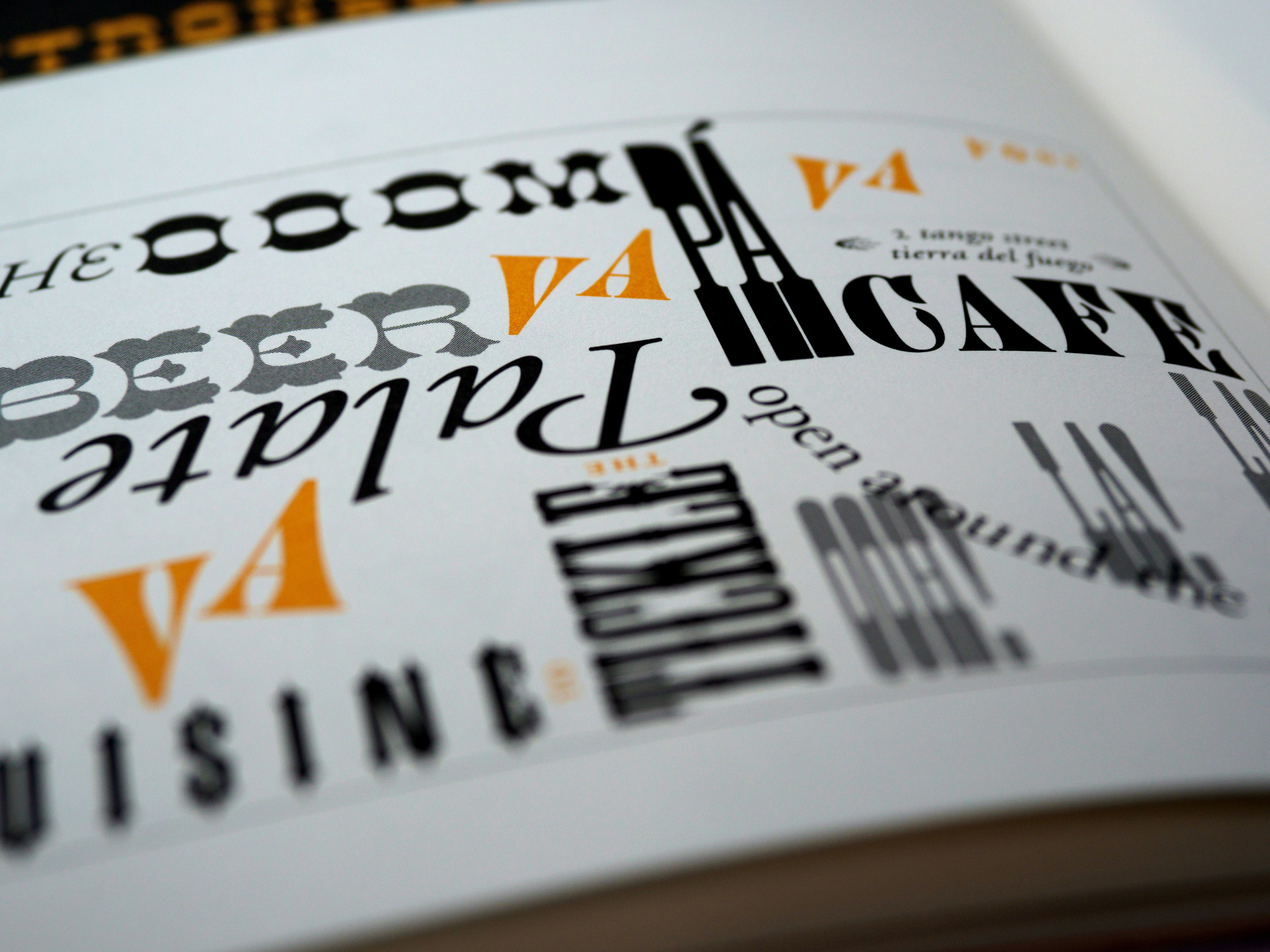
Let's Talk Typography...
Typography is more than just the art of arranging type; it’s a powerful tool that conveys emotion, builds identity, and communicates your brand's essence. WWW understand that the right typography can transform a brand from ordinary to extraordinary. Let’s delve into the world of typography and explore how it shapes the visual language of your brand.
The Essence of Typography
Typography is the voice of your written content. It sets the tone, evokes emotions, and guides the reader through your narrative. It’s a subtle yet potent element that can influence perception and reinforce your brand’s identity. At WhoWhatWhy, we approach typography with the reverence it deserves, ensuring that every typographic choice aligns with your brand’s core message and aesthetic.
The Fundamentals: Choosing the Right Typeface
Selecting the right typeface is akin to choosing the perfect outfit for a grand occasion – it must be appropriate, flattering, and reflective of your personality. Here are the key considerations we take into account when choosing typefaces for our clients:
Brand Personality
Your typeface should mirror your brand’s personality. A modern sans-serif may convey minimalism and innovation, while a classic serif might evoke tradition and reliability. Understanding your brand’s character is the first step in making an informed typographic choice.
Readability and Legibility
No matter how beautiful a typeface is, it must be readable. We ensure that our typographic choices are legible across all devices and formats, providing a seamless reading experience for your audience. Readability also involves appropriate spacing, sizing, and contrast, all of which we meticulously consider.
Versatility
A versatile typeface works well across various mediums, from digital screens to printed materials. We select typefaces that maintain their integrity and readability, whether on a mobile phone, a billboard, or a business card. This adaptability is crucial for maintaining a consistent brand identity.
The Art of Pairing Typefaces
Pairing typefaces is both a science and an art. The right combination can create harmony, contrast, and visual interest, enhancing the overall design. At WhoWhatWhy, we follow a thoughtful process to ensure typographic synergy:
Complementary Styles
We choose typefaces that complement each other stylistically. A bold headline font paired with a clean, readable body text creates a balanced hierarchy and guides the reader’s eye naturally.
Contrast
Contrast in typography adds dynamism and emphasis. By contrasting weights, styles, and sizes, we create visual interest and highlight key information. This technique is particularly effective in drawing attention to calls to action or important messages.
Consistency
While variety adds interest, consistency ensures coherence. We maintain a consistent typographic style across all brand materials, reinforcing your brand identity and making your content instantly recognisable.
Typography in Action: Crafting Brand Narratives
Typography is a storytelling tool. It adds a layer of meaning and emotion to your brand narrative. Here’s how we use typography to enhance your brand story:
Emotional Resonance
Different typefaces evoke different emotions. A whimsical script might convey creativity and playfulness, while a sturdy slab serif could exude strength and dependability. We select typefaces that resonate emotionally with your target audience, aligning with your brand’s voice.
Visual Hierarchy
Effective typography guides the reader through the content, establishing a clear visual hierarchy. Headlines, subheadings, and body text are carefully styled to create a logical flow, ensuring that your message is communicated clearly and effectively.
Brand Recognition
Consistent use of typography builds brand recognition. Over time, your audience will associate specific typefaces with your brand, enhancing recall and loyalty. We ensure that your typographic choices are distinctive and aligned with your brand’s identity.
The Fonts of 2024: Our Top Picks
We are excited to showcase some of our favourite typefaces that embody the essence of modern branding. These fonts are not only visually striking but also versatile, making them perfect choices for a wide range of design applications.
Roc Grotesk
Roc Grotesk is a contemporary sans-serif typeface that combines clean lines with a touch of retro charm. Its versatility makes it ideal for both digital and print media, offering a bold and distinctive look that captures attention. Whether used in headlines or body text, Roc Grotesk brings a sense of modernity and sophistication to any brand.
General Sans
General Sans is a minimalist typeface that excels in readability and clarity. Its straightforward design is perfect for brands that value simplicity and elegance. This font works seamlessly across various platforms, ensuring that your message is conveyed with precision and style. General Sans is particularly effective in creating a sleek, professional image.
Cardinal Fruit
Cardinal Fruit is a unique typeface that adds a playful and quirky touch to your brand. Its whimsical design elements make it perfect for brands looking to inject personality and creativity into their visual identity. Cardinal Fruit is versatile enough to be used in both headlines and decorative text, making it a great choice for brands that want to stand out and make a memorable impression.
Recoleta
Recoleta is a serif typeface that brings a touch of vintage elegance to modern design. Inspired by 1970s typography, it combines soft, rounded forms with a robust structure, creating a harmonious balance between nostalgia and contemporary appeal. Recoleta is perfect for brands that want to convey a sense of heritage and timelessness while maintaining a fresh and stylish appearance.
Integrating Our Top Fonts into Your Brand
At WhoWhatWhy, we don’t just select fonts based on aesthetics alone. Each typeface is chosen for its ability to enhance your brand’s story and resonate with your target audience. Here’s how we integrate our top fonts into your brand identity:
Customisation and Adaptability
We understand that every brand is unique, which is why we tailor our font choices to fit your specific needs. Whether you’re aiming for a modern, minimalist look with General Sans or a playful, vibrant feel with Cardinal Fruit, we ensure that your typography aligns perfectly with your brand’s personality.
Cohesive Visual Language
By carefully selecting and pairing fonts like Roc Grotesk and Recoleta, we create a cohesive visual language that enhances your brand’s communication. This consistency is crucial for building brand recognition and ensuring that your message is delivered clearly and effectively across all mediums.
Emotional Connection
Typography is a powerful tool for evoking emotions and creating a connection with your audience. Our top fonts of 2024 are chosen not only for their visual appeal but also for their ability to resonate emotionally with your audience. This emotional connection is what turns casual viewers into loyal customers.
by
WHOWHATWHY
/
Share Article
Read more


